Blog 12: Color Psychology 2026: Earth Tones and Jewel Palettes
Blog 12: Color Psychology 2026: Earth Tones and Jewel Palettes
In 2026, the emotional resonance of color has never been more critical. The prevailing color palettes—the psychological anchors that define consumer preference—are shifting away from generic brights and generic pastels towards two distinct and powerful emotional hubs: "Grounding Earth Tones" and "Optimistic Jewel Palettes."
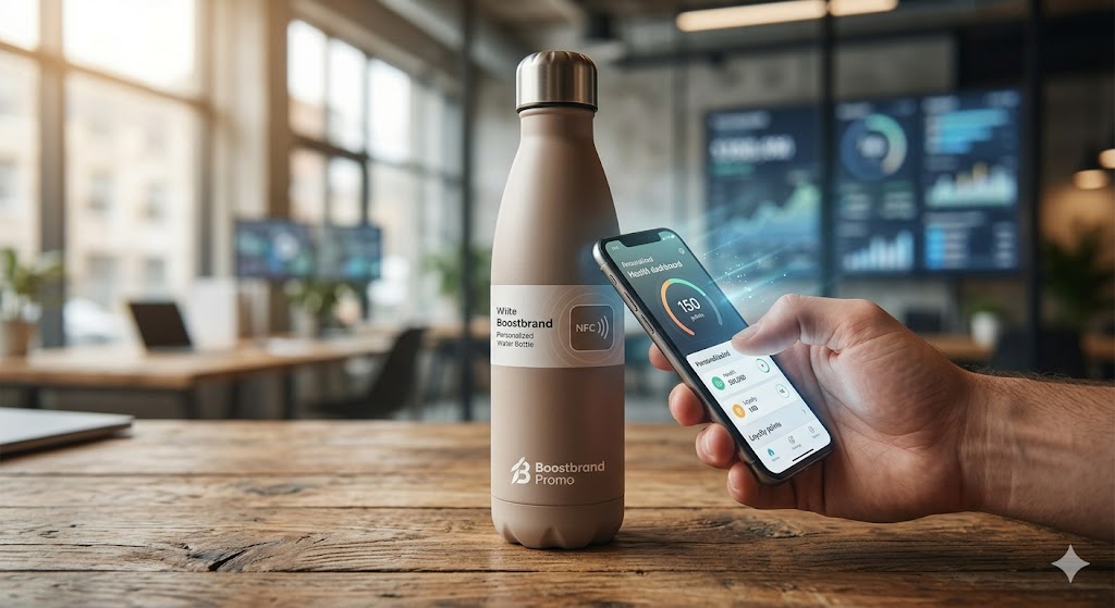
The first, Grounding Earth Tones, dominates in categories like sustainable apparel, eco-friendly office goods, and outdoor lifestyle accessories. This palette is defined by deep, rich terracotta oranges, warm mossy greens, soothing sandy beiges, and muted charcoal greys. These colors evoke a sense of stability, connection to the natural world, and inherent durability. When we source recycled materials, we intentionally look for fibers that can hold these deep, understated hues, ensuring a product that looks robust and values-aligned.
Conversely, we are seeing a parallel trend toward Optimistic Jewel Palettes in categories like premium tech gadgets, high-end awards, and exclusive corporate gifts. Think deep emerald green, sapphire blue, ruby red, and a bright, vibrant amethyst purple. These colors signal luxury, high performance, and a renewed sense of confidence. They create a strong contrast on a desk or a shelf, demanding attention and conveying a message of unique value and high quality.
As a supplier, our strategic advantage in 2026 lies in color flexibility. We must offer a diverse range of products that can be customized across both of these core palettes. A single product, available in both terracotta and amethyst, tells two entirely different stories. For distributors, the goal is to align the client’s brand values with the emotional triggers embedded in these powerful 2026 palettes, ensuring the promotional product hits the right emotional note every time.